
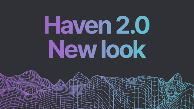
HAVEN 2.0 New Look
Haven Website Relaunch
As the Haven Protocol project was gearing up for the launch of Haven 2.0, the marketing contributors took the time to consider how the project could be better presented to new users. The website is an important part of this process. It fulfills a number of objectives as we aim to clearly communicate the protocol’s purpose, onboard new users, and support existing ones. This content is constantly growing and will improve over time.
The look and feel are also very important as it conveys the project’s aspirations. Feedback from the recent survey confirmed, overwhelmingly, a perceived benefit from repositioning the design to make the website more mainstream. Building trust and broader appeal.
In Summary:
- Community feedback suggested the site design and identity could be adjusted to improve growth and participation
- Community consensus through a survey confirmed this
The decision was made to start the process of refreshing the identity and website.
The survey also provided some insight into the kind of people holding Haven, this made it possible to build a basic persona of the average holder that could, in turn, be used to inform the brief.
To produce the brief a benchmarking exercise was completed, analyzing the websites of popular cryptocurrencies, including privacy and stable coins. Attention was also paid to sites that have a broader and more mainstream reach.
From here a list of the best and worst elements from each site was produced and a mood board was put together to go into the brief.
One of the striking things about the website work was the similarities across a large number of them. The analysis summary included the following remarks:
- Lot’s of Neons, gradients, soft edges, futuristic shapes, and geometry – Circa 85% of sites use these as brand identifiers
- Blues, purples, and greens are strong colors used throughout – Circa 70% of sites use these are their primary pallet
- Lots of movement and hover animations – Almost all sites use motion. This result in a modern edgy feeling
- All sites feel advanced, have depth, or complexity in their design – Contributing to the hi-tech feeling of the site
- Most sites allow their overarching brand identity to influence the web design – Making the brand experience joined up
- Information is presented with a traditional conversion funnel approach – This proven approach to the hierarchy of the information optimizes conversion
- All coins make BIG claims about what they will(!) achieve – This provides a sense of “in this together to change the world”
The survey and the benchmarking exercise formed the foundations for the brief, the executive summary of which was:
As part of the HAVEN 2.0 relaunch, the project will release a new website with an improved tone of voice, visual identity, and messaging. This new TOV and brand will be less “dark and underground” than the existing website.
For the most part, the existing content will be reused, however, there are some additional creative deliverables.
- Rebrand and adopt a more crypto-centric design in line with the benchmarked websites without becoming a “me too brand”
- Keep the logo
- More mainstream messaging
- Change the color scheme
- Change the iconography
- Change the text formats
- General Reskin
- Content refresh
- Improve messaging on the home page
- Reconsider KB structure
- The Problem and Solution page
At this point, it is worth explaining why the decision was taken to adopt similar design principles as the benchmarked sites, but there is some psychology and marketing theory here that you might not be interested in.
A big marketing concept and one really defined by the godfather of modern marketing, Seth Godin, is summarised with the following statement
People like us (do things like this)
This exceptionally profound concept delves into the human condition and surfaces with a theory so powerful it attempts to explain “why”.
For most of us, from the first day, we are able to remember until the last day we breathe, our “why” is primarily driven by one question, “Do people like me do things like this?”
Godin sights various academic examples in his literature to validate this concept, but in the most simple terms, he outlines the need to understand who “we” (people like us) are and theorize that these “we” are all ignited by the same ideas, follow the same morals, and get excited by the same things (things like this).
In the case of the Haven Website:
- “People like us” is – the wider crypto audience
- “Things like this” is – seeking out and investing in familiar cryptocurrencies
The connection between expectation and design is powerful and aligning the Haven identity with the strong crypto-centric design will improve the sentiment around the project helping it to appeal to a wider crypto audience.
More from Seth Godin on People Like Us (Do Things Like This) can be found here
Thanks to MadLentil, MattyK, Johnny Utah, rarecommons, AHawk, Harlequin, Enzodellasiglia, Zab, Drayan, Frenchy, Mash, Kleinroy, xS, and the many others involved in the delivery of this project